- Space Savers
- Season 1
- Episode 1
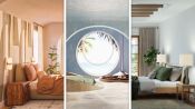
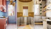
3 Interior Designers Put Their Spin on the Same Luxury Loft
Renders provided by Spacejoy, a design-led commerce platform powered by interactive 3D technology. Spacejoy pairs customers with expert designers to create a stunning home featuring handpicked products from top brands that you can shop instantly. https://www.spacejoy.com/
Featured Artwork:
Richard Caplan Photography https://www.richcaplan.com/
Seth Caplan Photography https://seth-caplan.com/
Nick Carter/Verasson Creative http://www.verasson.com
Olivia Cognet https://www.oliviacognet.com/
David Patterson Photography https://davidpattersonphotography.com/
Colin Price Photography https://colinprice.photography/
Christopher Stark Photography https://www.christopherstark.com/
Released on 07/12/2022
[Announcer] These three interior designers
have been given a photograph of an empty luxury apartment.
They have free reign to design it in any way they please.
I'm Noz Nozawa.
I would describe my style as bold, narrative
and a little weird.
My name is Darren Jett
and my designs are sophisticated, glamorous, chic.
My name is Joy Moyler.
When my clients come to me,
they're looking for relaxed, approachable and classic.
[Announcer] No clients, no restrictions, just blank space.
Looking at the space in front of me,
my first impressions are very much, Wow, this is a box.
There's not a whole lot of architectural interest,
except for these extraordinary windows
with an even more extraordinary view of New York.
It looks like it's a new build
or it might be an apartment building
that has been recently renovated.
It feels very developer spec to me.
I love the geometry of the space,
the floor, the ceiling, windows of course.
This has a lot of potential
to be something really spectacular and really cool.
[chill music]
Right now, the kitchen sort of takes up
half of the entertaining zone,
and what I would really like to do
is to essentially bring this wall in a bit further,
and I think in an apartment like this,
having much more of a wet bar look,
even though it really is a chef's kitchen behind,
could be something that would be very cool.
Really, I'd love to incorporate marble.
If we actually clad all of the cabinetry in the same marble,
thus creating much more of a jewel box moment.
First, I'm gonna start with the kitchen.
She's boring.
I wanna take some of the wood and move that up.
So maybe we'll do a wood island,
maybe we'll do a wood range hood,
so that we bring that wood texture and that warmth
but up and lift it up off of the floor.
And then I wanted to still warm things up,
so that's why instead of a range hood
where you can see the stainless steel,
we're doing a wood-clad range hood
with the liner up hidden inside.
The back wall of the cabinetry,
I'm going to introduce a little bit of blue
to really mirror that sky.
The rest of it, I'm just gonna kinda keep it the way it is.
There's clearly not a good flow through the kitchen.
The existing peninsula, it just cuts off access,
'cause if you're all the way here, over by the pillar
looking at the view, I don't want you to have to go
all the way around, around the peninsula,
just to get to the fridge so you can have a glass of water
or a refill of your wine.
That's silly.
So I'm gonna remove the peninsula
and replace it with a floating island.
The island appears to be
just maybe a simple white corian island.
I'm going to introduce a little bit of stone to it,
'cause I think stone is much more luxurious
than simple white corian material.
I'm going to paint the underside of the island,
just to create a little bit more dimension
and a little bit of shadow line underneath the island.
I think that'll be a nice little touch.
[chill music]
To be honest, I love these floors.
I think they're so beautiful.
They're a wide plank oak, but I love the idea
of playing with all of the surfaces that are volume,
so the ceiling, the walls, and now the floors,
all being white.
I'm not someone who loves a wood floor.
There's something very very luxurious
about softness underfoot,
so if we think about something,
almost like a silk, for instance, below,
something that would be very very soft.
I wish you could put your hand on this right now, like I am.
It feels incredible.
I also think that introducing a rather bold color
on the ground plane that sort of matches
perhaps the sky that we're seeing
is a nice reference point as well,
and can drive the design of the project even further.
[chill music]
What I would really like to do
is to always think about the view,
always thinking about warming up the space.
What I would love to do more than anything
is to embrace that feeling by cladding this entire wall,
including around the portal to the kitchen,
in a bronze mirror.
Obviously it makes the space feel twice as big,
but also it makes everyone look so good.
I absolutely loathe a white ceiling.
What I would like to do
is also think about cladding that ceiling,
so it would create more of a womb-like effect.
This is something that's very cool.
It is a piece of brass that has been oxidized,
and the more oxidation that happens on this side,
the darker it gets,
and it sort of creates this ombre degrade,
and what could be very cool
is to actually have the darker brown here
up against the mirrored wall,
and then the lighter portion up against the view.
And I would love to create a sort of regulating rhythm
with the panels, and just maybe up against the windows,
it starts to kind of kick back, like a slight curve
that maybe offsets the column here,
and everything feels very architectural.
And then we're able to actually clad
the column in the corner in the same dry sienna,
so everything feels very considered and very put together.
In an effort to tone down all the crisp white
so it isn't overly done,
I'm going to play off the underside of the island,
and have the wall just a sort of gray taupe-y color,
so you don't feel like you're sitting in a white mass.
You don't want to feel like you're sitting in an igloo.
[chill music]
We've got mostly very minimalist, very modern contemporary
clean straight lines and right angles.
How fun would it be to contrast
off of these right angles and straight lines?
I love that it's just sort of this gorgeous arching snake,
but it also has structure, bringing that into the space
and making it feel a little bit warmer.
So this gorgeous little set of neutrals
is my favorite set of pebbled leathers.
I'm thinking of using of these very soft white
or soft off white leathers on the desede sofa in the back.
So for the rugs in the space, they're actually rectangles,
but then they're floofy and soft and really comfortable,
and they've been woven to not have certain elements.
There's actually holes deliberately cut into the rugs,
and that brings back that organic nature
of what I'm doing with the rest of the furniture.
I'm using this wall here as an opportunity
to define that living room space,
and first thing you wanna do
is you wanna have a big comfortable sofa.
I always like to have a nice soft textile on the upholstery,
particularly the biggest piece of upholstery.
That often gets the supplest and the most tactile textile.
I really do love a white sofa, but don't be afraid.
There's a wonderful product
out there in the world called crypton.
You could literally pour an entire bottle of red wine
on crypton textiles and they are not going to stain.
I often really like to start from the architecture
and the finishes.
Right now, up until this point,
it seems like everything is feeling minimal,
everything is feeling a little bit hard.
We're using hard stone, we're using mirror,
we're using brass on the ceiling.
It could be very nice to perhaps offset
all this harshness that we're creating
with something very very soft and amorphous.
Thinking about designers like Verner Panton from the 1960s,
other space age designers,
even to today, someone like Misha Kahn,
who's creating these very fantastical forms.
So perhaps, instead of having a form that is very flat,
maybe it's something that is kind of wavy.
So if we think about fabrics, perhaps having a tapestry
or sort of pattern on top of it,
perhaps in a Jean Lurcat type of pattern,
which brings in a bit of art deco, a bit of shinwa,
but it still feels very modern,
it still feels like it could be very cohesive in this space.
So the coffee table and the two chairs
are very much a part of this sort of organic modernism
of the space.
I specifically wanted swivels
so that you could face your friends in conversation
or turn out and face the view,
because that's such an incredible part of the space,
and then we were thinking of using
really nubby, cozy, comfy fabrics on it.
I really wanted to play with different hues of off white,
this sort of idea that they're perfectly imperfect together.
While they're actually white and sort of delicate looking,
these are, in fact, very very much made for, quote,
intense residential use,
so they're very practical in that way.
The actual lived experience of being in a space like this
is very much about all five senses,
so texture and how it feels, not just with your hands,
but also against your arms and the back of your leg
when you're lounging, all of that is so critical
to actually enjoying the space and being in it.
I love the idea of keeping the rest of this volume
sort of empty, but having a circular shaped coffee table,
because a circular object is always much easier to navigate
than something that has corners.
I love the idea of having a front facing lounge chair here,
which also permits visibility,
clearly outside of these windows.
Whenever I'm using a lounge chair,
I like to have an end table.
You need a space to put a glass down,
maybe to put your eyeglasses, your iPad.
You don't need to have a sideboard.
I think it's a functional thing to do.
It's a place to put down a food tray or serve drinks.
[chill music]
I get really edgy
when people fight for the head seat at a dining table.
I don't like that sort of hierarchy.
I think, at a round dining table, everyone's equal,
and when you're laying out a space, the rule of thumb
is the distance between the face of the table
and the next object truly is 36 inches for comfort.
So with regard to the dining space,
this table that I'm choosing is by Casey McCafferty.
It almost looks like a little wood monster.
So I'm very much still repeating
this sort of white on white on light on white neutral,
so we've got a very lovely off white carpet
on the white floors that have been painted,
and then the wood is very much a bleached ash
or a bleached oak.
So it's very light but a bit warmer, and that sort of adds
some of that organic warmth and texture back in.
I really am into the idea lately
of creating these dining rooms that are much more casual.
If you use them, you use them.
If you don't, it's also okay.
It's not an empty chair and an empty table.
So if we had something that was sort of rigid on the outside
that matched maybe the architecture of the box,
but we had something on the inside
that was much more of an amorphous form,
we could create something like this,
and then you would have a table
that could rise out of it like this.
I think it would be very cool also
to have maybe some seat pads,
and the whole idea is that those could perhaps move around.
It could be very nice to think about it
perhaps being in a leather.
I love this sort of citrine, chartreuse
kind of greenish yellow over here,
something that's very durable.
And I also perhaps like the idea
of thinking about all of this furniture sort of melting.
Perhaps we do these kind of spidery forms
but these might be something where it's a fringe
that kind of hangs down.
If we think about the plinth of the dining room
that's built up, maybe the cushions have fringe
that kind of folds off of that, right?
But I think we could do something a bit more dramatic
in a nice leather like this.
For the rest of the dining seating, both at the island,
the bar stools at the island and the dining chairs,
I wanted them to be really inviting and playful.
So for the dining chairs,
those are the Monsieur Oops chairs from Pierre Yovanovich.
I love what Pierre does.
I think these chairs are so cute.
So they're both adorable and upholstered,
so they're legitimately comfortable.
Then, at the kitchen island,
I wanted all of the seating at that island
to be similarly linear, but still playful.
I love the geometry on these chairs that I'm selecting.
I love that the frame really sort of sets a tone.
I love the use of the retan caning against the black frame
of the dining chairs,
because they mimic the framework.
That same sort of detail starts to appear
at the counter stools, but in a different coloration,
so that's a play off of one another, the light and the dark,
and if they were all the black frames,
it would start to look very very heavy.
So creating a little bit of relief in the room
comes from lightening up the material of the counter stools.
[chill music]
I love lighting.
I think it's very often an opportunity
for you to use something very functional,
but treat it as an art form
and a piece of art in your space.
Both the chandelier and the pendants in this space
are from the 2018 body of work from Rogan Gregory.
They're both amazing, and it's actually this same material
as the coffee table in the living room,
so we have things that come both from the ceiling
and up from the floor in that same material.
I did pendants over the kitchen.
We've got this idea to stagger the pendants height wise
and then also install them in the ceiling
not exactly in a line, so they're more in a cluster.
And then this crazy, wild, amazing, big blobbo light fixture
is deliberately oversized
and meant to sit over the dining table
as an art piece basically.
And then, of course, you can't only have light
coming from the ceiling.
I want for some of the light to be rooted in the floor,
so I'm obsessed with Annie Lee Parker's pieces.
It's two points of light,
and she basically hand makes these pieces from clay
and casts them, and then adds the globe lighting afterward.
Having, stylistically, an aesthetic
where all the lights still feel organic
and feels of a similar shared brain,
even though they're by two different artists,
is kinda cool.
I love the female male relationships
of furniture and decorative objects in a room.
With the chairs being very geometric in shape,
I think it was a nice introduction
to use cone shaped pendants over the table.
And then lighting over the island,
that sort of dome shape, I think, softens that space up.
I absolutely insist that all of the lights
on all of my projects are dimmers,
because you've gotta increase the sexy, right?
You can't do that if you've got a bunch of 60 watt bulbs
constantly glaring in your face.
So you'll notice
that we don't have a lot of overhead lighting in the space.
I also am not a big overhead lighting person.
I think that the best lighting
really comes from ambient lighting,
usually on the perimeter,
or spotlights on specific points of art.
You never really want a light
that's on your forehead, right?
That's never flattering for anyone, you or me.
But instead of doing a statement light piece,
I would love to do something here
that really embraces the height
and makes the space feel higher,
since we're creating very low seating,
and there could be something interesting
about maybe picking up on this idea
of the fringe cushions that we're doing
and having fringe lights that come from the ceiling,
and that whole thing is lit within
and creates a really nice moment.
Imagine that in the evening, just turning that on,
dimming it very very low and how that would look.
[chill music]
I love art.
I don't think any space is complete without it.
But for a space like this,
a New York vibe, New York environment,
I'm really drawn to geometric shapes
and much more abstract or geometric art.
No one really likes
to look at themselves fully all the time.
I think there's something very evocative, a bit mysterious
about having the depth behind you of a mirror,
that reflection,
but in front of you is a beautiful piece of art,
and it's really about offsetting the modernity
that we're putting within all the architecture.
So the artwork that I'm thinking of using
is actually also ceramic, so again,
kind of similar to the light fixture from Annie Lee Parker,
and it's by an artist, Olivia Conye.
I love her work so much and I love femme artists
who take up a lot of space with their work,
so big monumental pieces is really inspiring to me,
and that plays off of the casting of light so beautifully
that it felt like I wanted to feature that in this space.
[chill music]
As you can see, I am very much envisioning
a lot of white surfaces, a lot of white furniture,
a lot of white everything.
But obviously I love color, so what I'm thinking of doing
is using color by way of light and translucency,
by turning this whole wall
and making them almost a very modern, maxed out sized
stained glass installation.
So when the sun passes through the windows
and onto all the furniture and the walls,
you get color coming through the windows
and that basically floods the whole apartment
with colorful light.
There's nothing that is as simple to do,
besides paint perhaps, that can totally change
the effect of a space than the movement of a drape.
I think in this space that clearly gets a ton of light,
the view is absolutely incredible.
If I had this view,
I would absolutely leave it open maybe 50% of the time,
but the other 50% of the time, I would close it.
And if you want to think about a late afternoon
when the sun is very harsh, you close that
and then the whole space lights up
almost like a Japanese lantern.
Everyone looks amazing in that light,
and you're in this sort of womb space
but you're floating in the clouds.
[chill music]
I honestly love this design.
I'm very proud of it.
It was a fun challenge for me because so often,
I am using literal colors in a space.
So my approach to this space
is really to follow the architecture,
follow the geometry of the space,
let that lead and sort of take it from there,
and it's all about how you wanna feel
when you're in a space.
I could really see this space as being for someone
who really loves to entertain.
I think there's something about this apartment to me
that feels very New York.
So perhaps it's almost like after an evening out,
we meet some interesting people and we just arrive here.
We're very lucky to arrive in this fantastic place
and we're almost watching the sun rise over the water
and it's coming into the apartment,
and we get these sort of deep shadows
that stretch across all the furniture
and really enriches all the fabric.
[chill music]
Ooh!
So different.
Oh my gosh, amazing.
Wait a minute.
Okay.
I mean, classic, iconic, I love it.
The high contrast, for me, is so major.
I mean, we knew, right?
Like hello, this is Joy Moyler, people.
I really like how crisp and clean it is.
I think the scale is really nice.
I love the pendants hanging above the bar
and over the island.
Also I love that every chair at the dining table
is an armchair.
I just never think to do that.
It just makes the caning so much more present in the space.
And I love caning.
It's a wonderful opportunity to provide something
that's semi-transparent, that also has texture,
that reduces the shine of other materials in the space.
I really want to be in this space.
I wanna sit at every single seat in here
and play with every single surface.
Really, I'm drawn to what you did with the windows.
I think that's very very cool and I can just imagine
that light sort of cascading on my face when I'm in there.
I love that she did the complete antithesis of what I did,
which was very angular,
and it looks like a really comfortable space
that you can just kinda hang out anywhere
and just enjoy yourself.
Yeah, I love that.
And so much great color.
Oh, thank you so much.
I thought, what if we created something
that was really embracing the sunrise,
really thinking about entertaining?
Nothing's too serious, nothing's too stiff,
everything's very low, curvy.
I love this so much.
The blue carpeting, first of all,
is just very inspiring to me,
and the first thing I noticed, of course,
is just the mirrored surfaces that you created.
I think that's so brilliant,
especially because it allows for a very democratic way
of seeing the view, that if I were seated, as a guest,
'cause I'd like to invite myself over,
if I were on the sort of window side.
You're invited.
Oh thank you.
Facing into the apartment, to be able to also get a chance
to see the view through the reflection, I think,
is a really thoughtful way of entertaining,
and I kind of thought of this space
as an entertaining space too, so I love this.
I love the low seating,
'cause when you have a little bit too much wine,
you don't have to fall far off the chair,
so that is something that speaks to my heart.
Sitting low makes the windows taller,
so that scale is immediately increased threefold,
that verticality.
And it's purely an entertaining space,
there's no television, there's no bookcase.
You just go there to party
and I want my invitation for next Friday.
I would even like to see elements of Noz's lights here,
replace what's here.
Oh, how fun.
I think that would be a wonderful way
to soften these lines,
which tend to be very geometric and hard.
And it's totally steel,
this idea of the color on the windows.
I think it's so sick.
Thank you.
Stained glass in a modern way.
And I'm obsessed with caning and still have never,
it didn't even occur to me, but I love that.
And the whole notion, I love that you were thinking
about the translucency.
All three of our spaces, I think,
really embraced the notion of translucency.
Like with yours, the caning, I love the idea
of the sun passing through it and casting shapes.
Shadows on the wall.
Yeah absolutely.
And then I love the idea too,
whereas mine, it's about where the light lands,
yours is sort of, where does the light pass through
and then manipulate shadows,
and then yours is about how does light refract
off of reflective surfaces?
So I'm obsessed.
These are amazing.
[chill music]
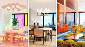
3 Interior Designers Put Their Spin on the Same Luxury Loft
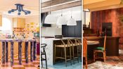
3 Interior Designers Transform The Same Kitchen
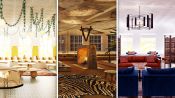
3 Interior Designers Transform The Same Soho Loft
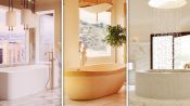
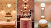
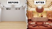
3 Interior Designers Transform The Same Luxury Bathroom
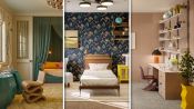
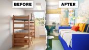
3 Interior Designers Transform The Same Bedroom
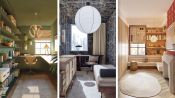
3 Interior Designers Transform The Same Home Office Space
3 Interior Designers Transform The Same Dining Room
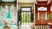
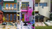
3 Interior Designers Transform The Same Foyer
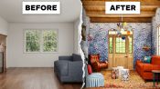
3 Interior Designers Transform The Same Cozy Living Room
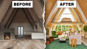
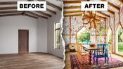
3 Interior Designers Transform The Same A-Frame Cabin
3 Interior Designers Transform The Same Walk-In Closet
3 Interior Designers Transform The Same Kid’s Bedroom
3 Interior Designers Transform The Same Galley Kitchen
3 Interior Designers Transform The Same Backyard
3 Interior Designers Transform The Same Basement Rec Room
3 Interior Designers Makeover The Same College Dorm Room
3 Interior Designers Transform The Same Small Apartment Bathroom